(7)Spellbound 2026 Visual Identity
- (Project type)
- Commissioned
- (Client)
- ALMARE
- (Year)
- 2026
- (Role)
- Visual Designer and Art Director
- (Fields)
- brand identity, logo design
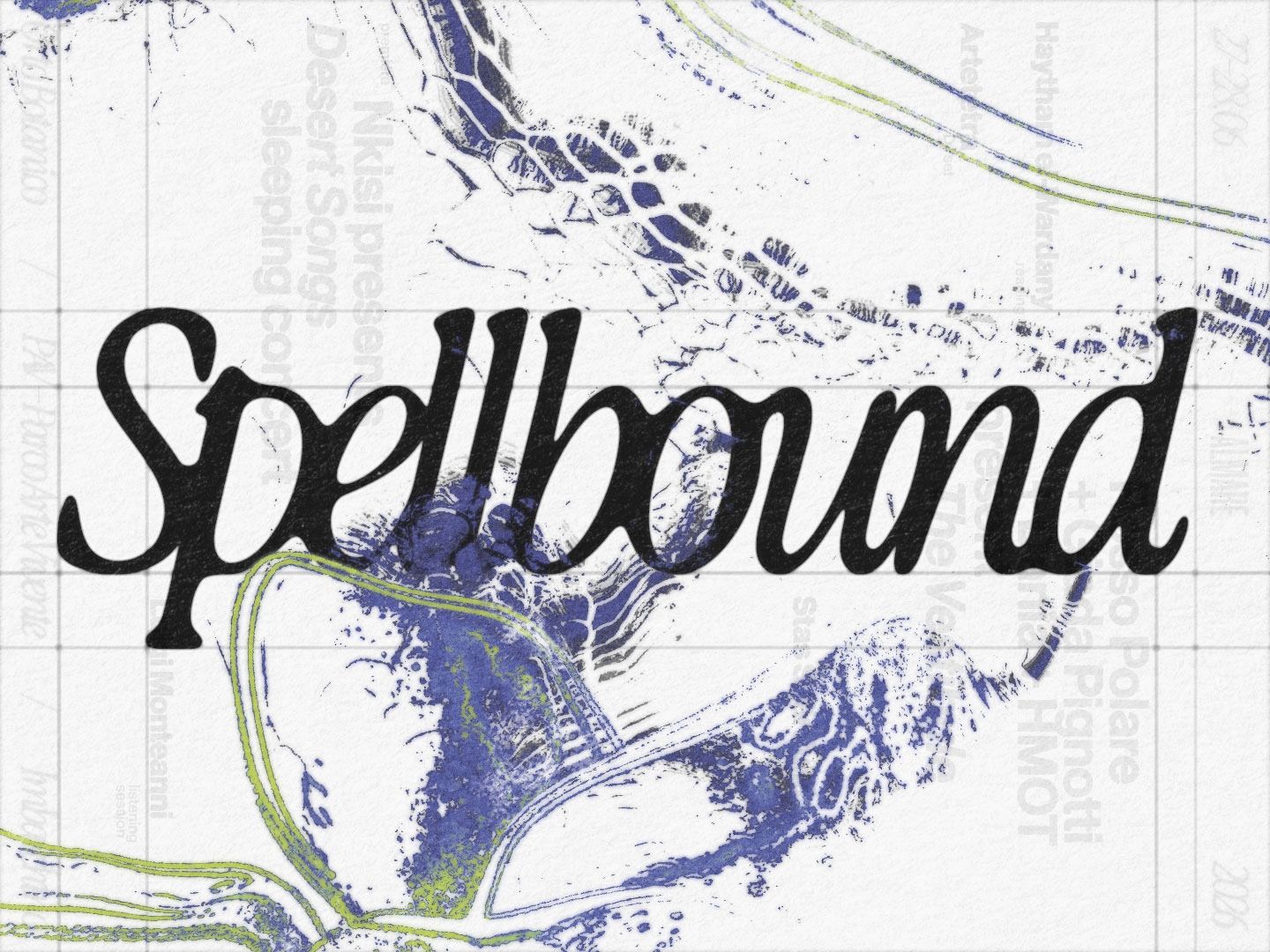
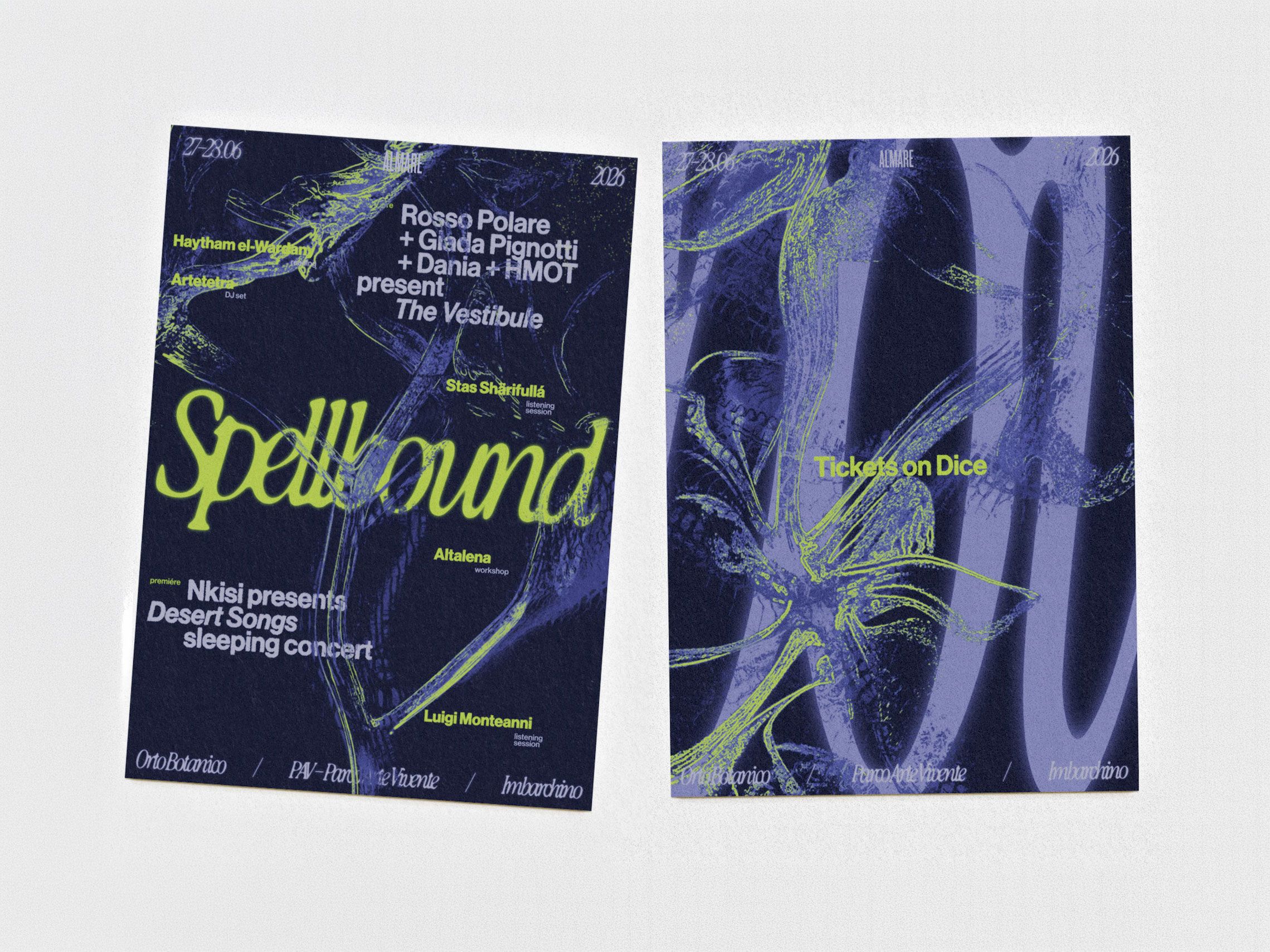
Spellbound is an annual festival by ALMARE exploring sound as a way of sensing, interpreting and relating to the environment. For its 2026 edition, the visual identity takes shape around the festival’s research into sound, landscape, memory and re-enchantment — imagining a visual language in which the organic and the synthetic are never entirely separate. The identity approaches nature not as something fixed or familiar, but as a space of transformation. Impossible botanical forms inhabit the system alongside a new logotype and a vivid, shifting colour palette, creating a visual world suspended between living matter and digital artefact, recognition and estrangement. Across the identity, forms appear to mutate, glow and dissolve, echoing Spellbound’s interest in more-than-human ways of perceiving and inhabiting the world. Rather than illustrating the festival’s themes literally, the system translates them into a changing visual atmosphere — one that feels at once organic, artificial and slightly otherworldly. Unfolding across two chapters, in June and September, the identity shifts with the festival itself. Each moment develops its own chromatic atmosphere, while a fluorescent yellow remains as a constant presence, connecting both chapters within the same visual world.
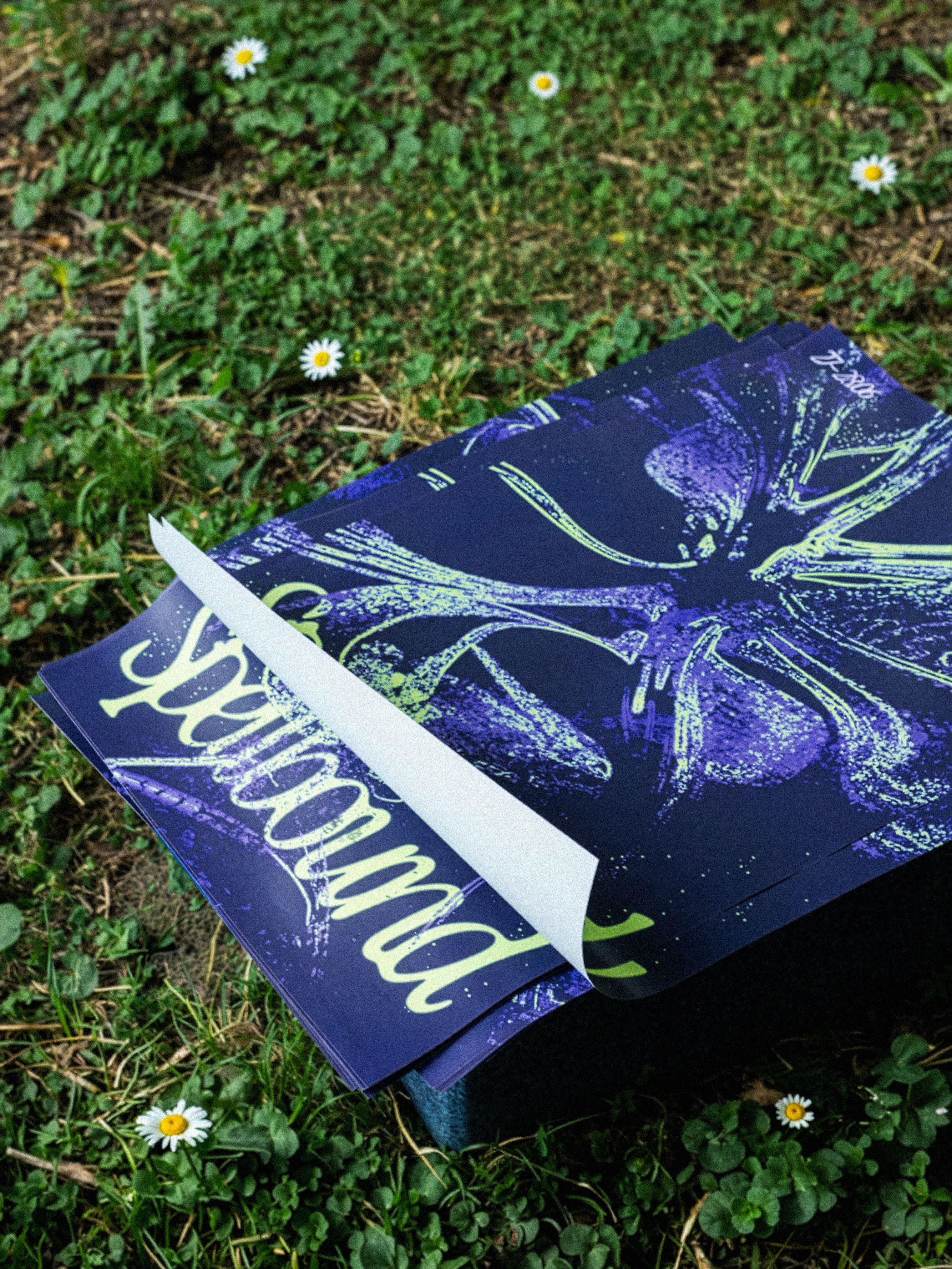
The wordmark behaves as an interconnected structure, with letters stretching towards one another and sharing their boundaries. Across the two chapters of the festival, the palette shifts from lilac and deep blue to pink and green, while a fluorescent yellow remains as a constant thread throughout the identity.
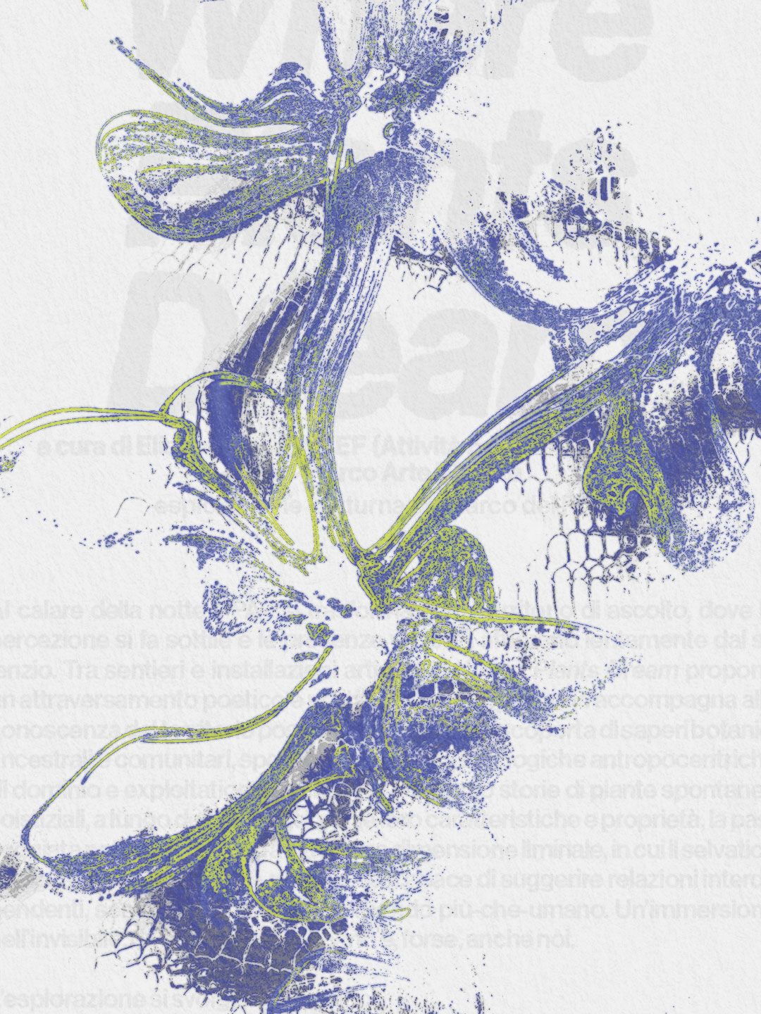
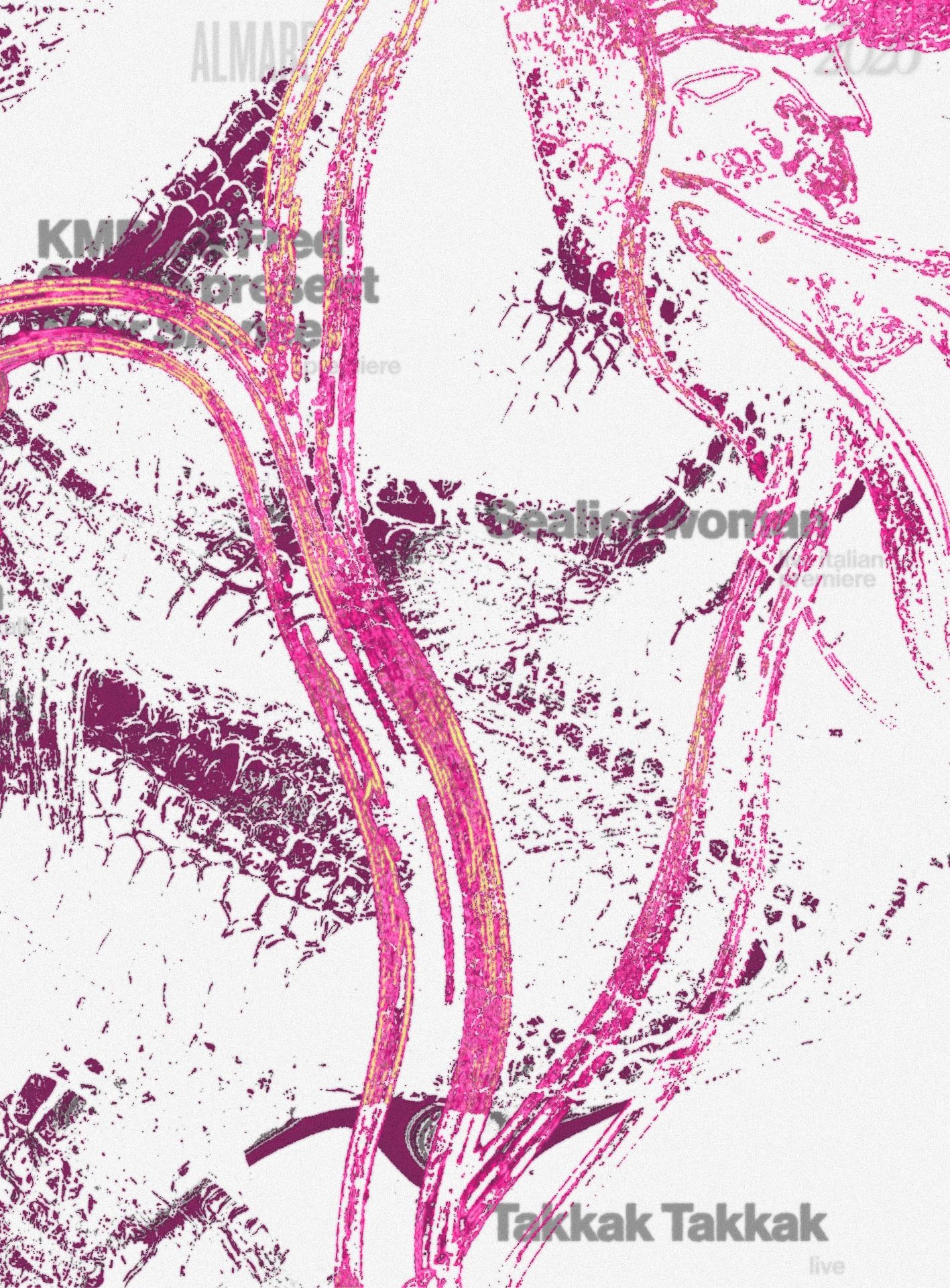
Impossible botanical specimens sit at the core of the identity, suspended somewhere between organism and digital artefact. Processed and transformed through TouchDesigner, their luminous forms remain deliberately unstable, dissolving the boundary between something grown and something generated.
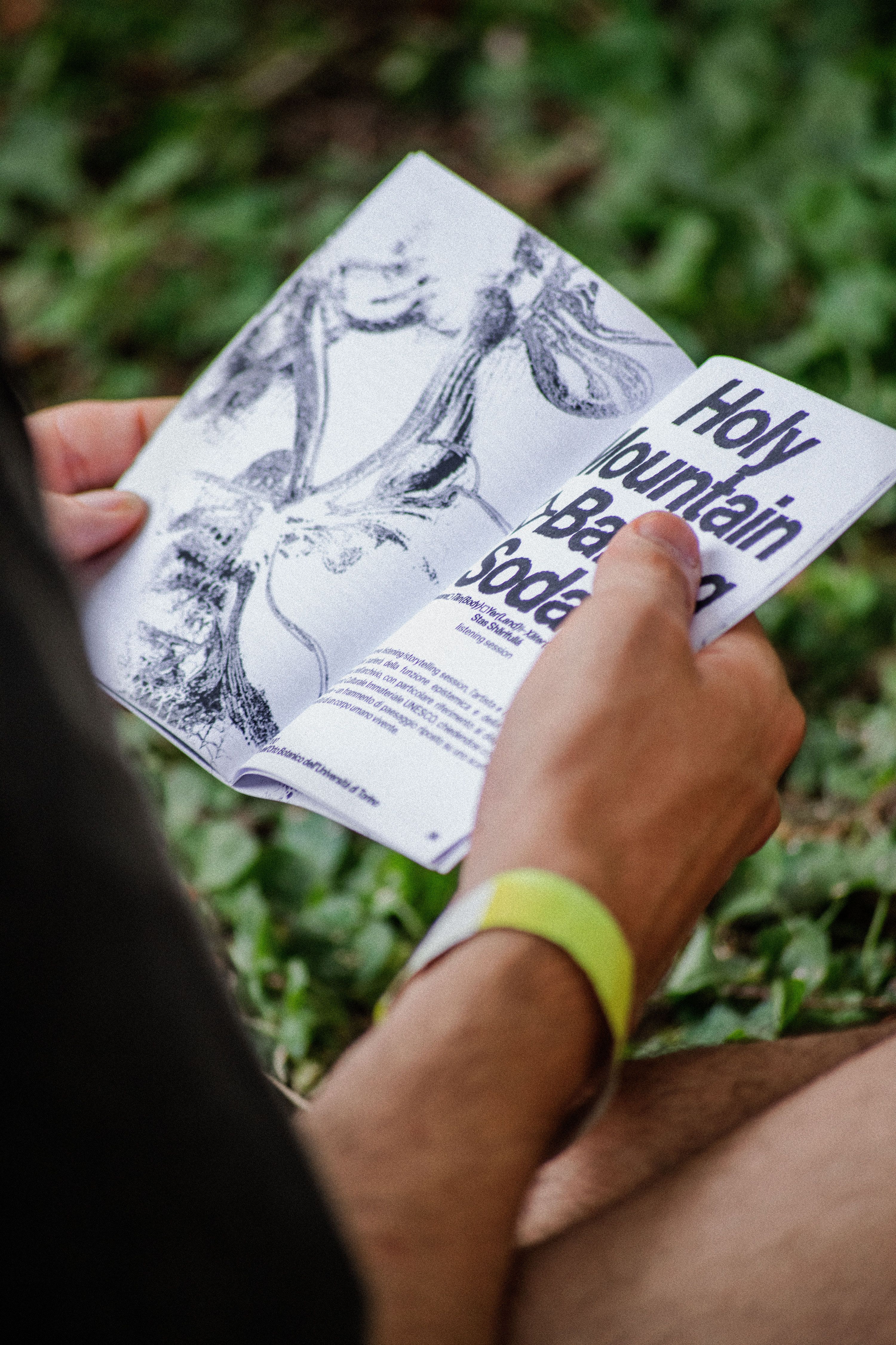
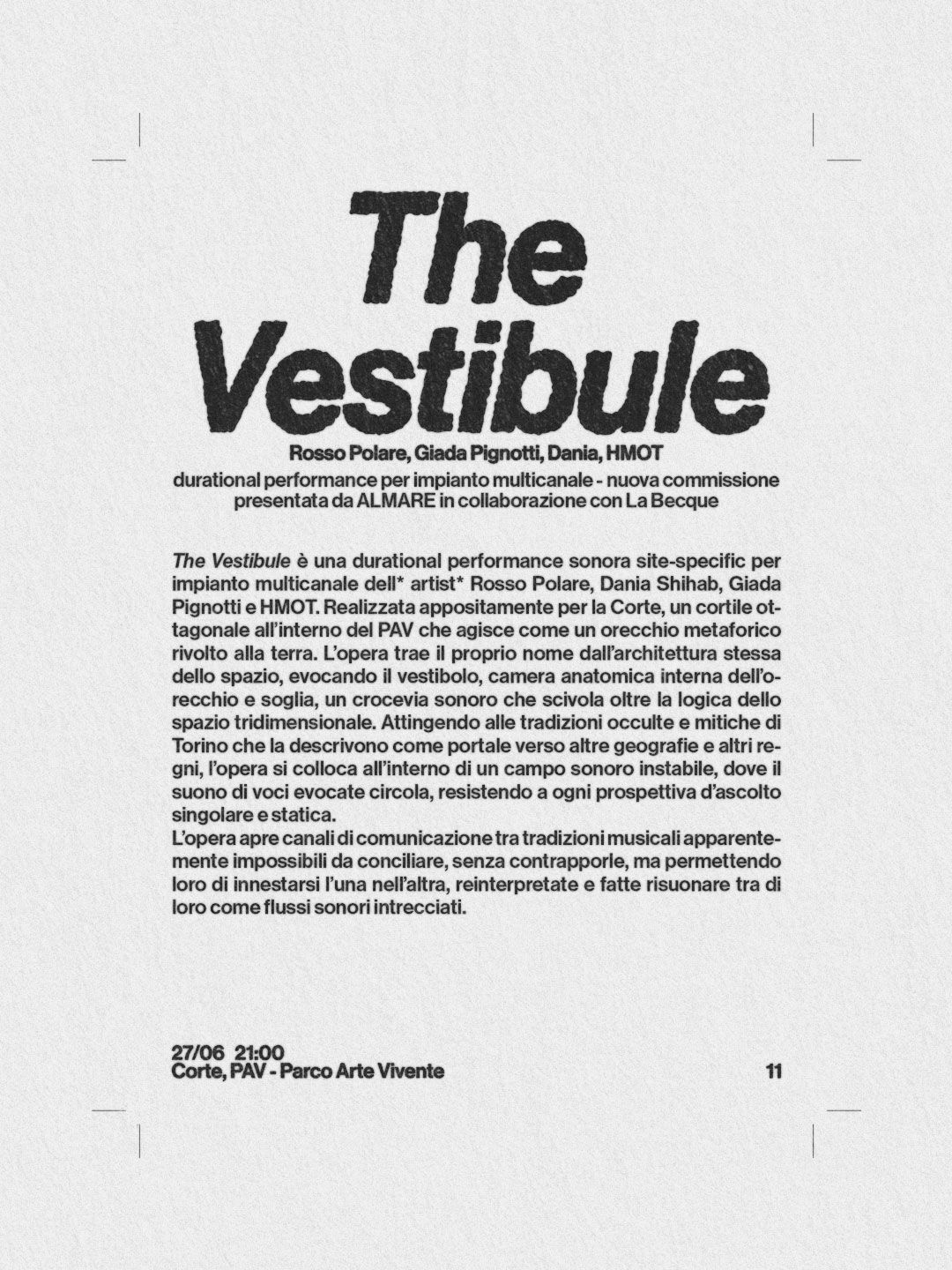
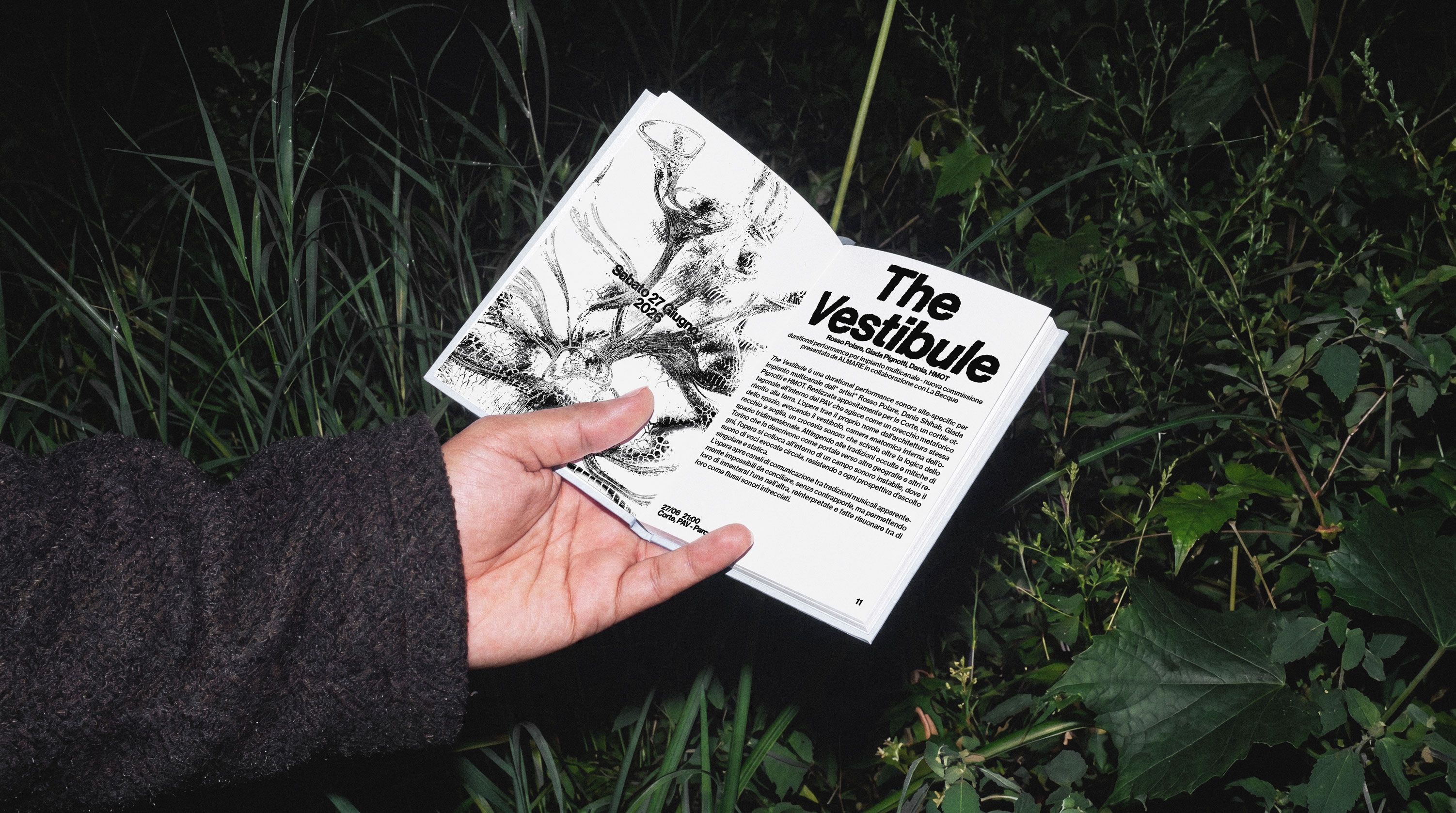
The festival booklet brings together the programme, artist contributions, commissioned texts and research surrounding the 2026 edition. Its denser editorial structure allows the visual identity to shift into the background, while typography, imagery and recurring graphic elements move between information and atmosphere.
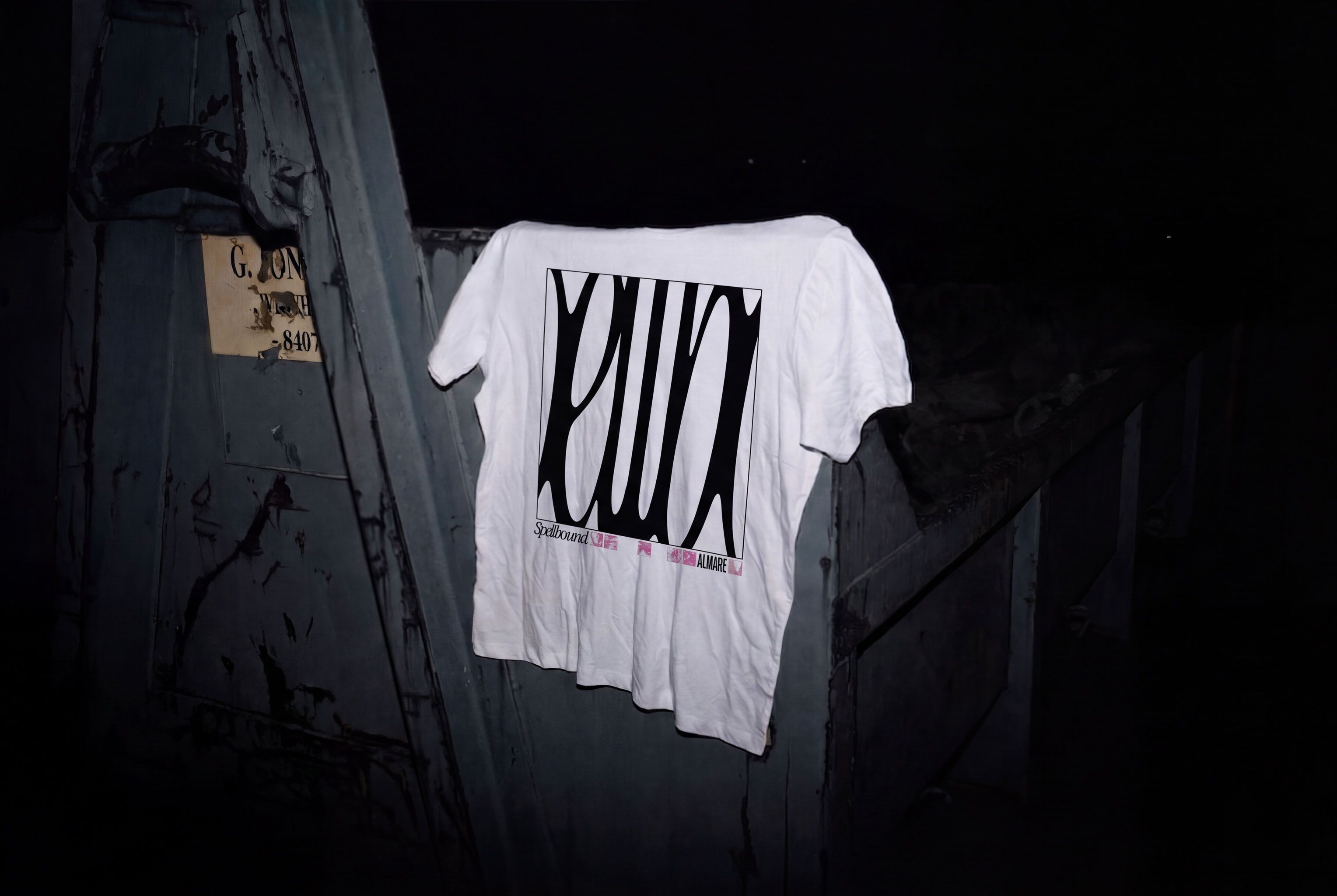
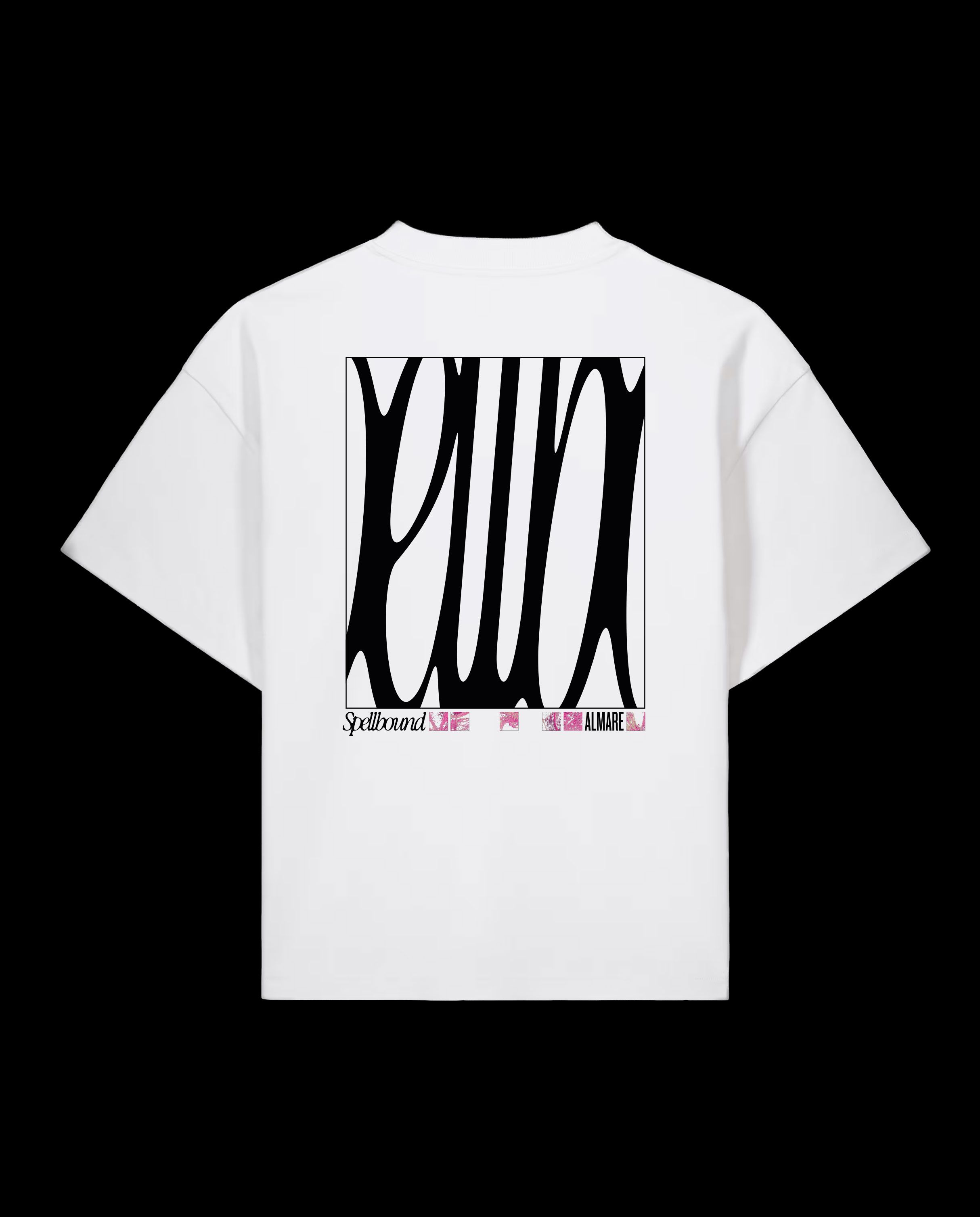
The identity moves from screen to body through a series of festival T-shirts, where the botanical forms become wearable fragments of Spellbound’s visual world. Removed from their digital environment, the organisms take on an almost emblematic quality, somewhere between botanical specimens, symbols and fictional species.